


Trading charts are more than colorful lines; they are vital tools for technical analysis, which is the study of price data to predict market trends. A forex chart visually represents how the price of a currency pair (two currencies traded against each other) changes over time. These charts help you see how markets behave, understand price patterns, spot developing trends, and identify trading opportunities. They simplify market data, allowing traders to make informed choices instead of guessing.
These charts illustrate how an asset has performed over time, providing insight into patterns of price action, changes in momentum, and the levels at which buyers or sellers have tended to take control. When interpreted properly, they are a global language among traders, a quick and ready criterion by which market conditions can clearly be judged.
The Core Components of a Trading Chart
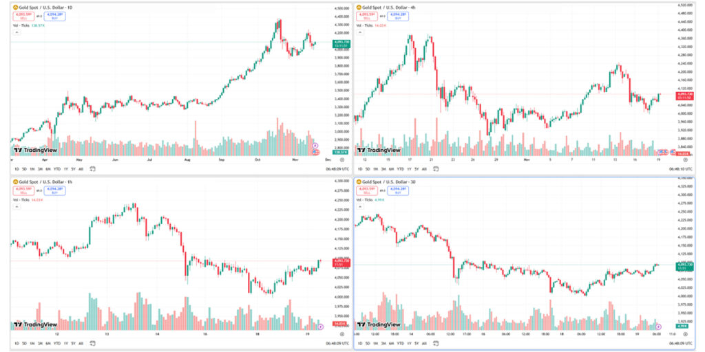
Forex charts have important parts for analyzing market data. Traders need to know these elements to make smart choices. The main components are time frames, price scales, and volume indicators.
The vertical axis represents the price at which an asset is traded, while the horizontal axis represents time. Together, they form a framework that captures the journey of price movements across specific intervals. Depending on the timeframe you select, a single candle or bar may represent one minute, one hour, one day, or even one week of trading activity.
Recognizing how price acts on different timeframes is key: shorter ones will often display sharper movements, whereas longer ones may expose larger trends. Price and time, as a pair or set of variables, form the foundation for all chart analysis. Price and time come together to form trend identification, pattern recognition, and technical forecasting.
The Most Common Types of Trading Charts
While many chart types exist, three primary formats dominate the trading world: line charts, bar charts, and candlestick charts. Each offers a unique perspective on price behavior.
Line Charts
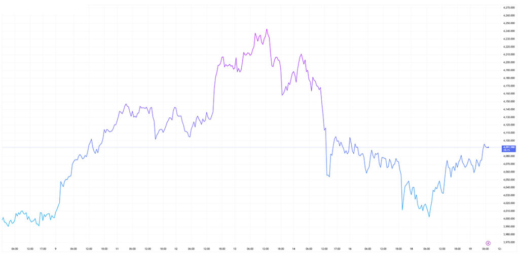
Line charts connect closing prices over time, showing overall trends. They are simple and clean, hiding minor details but showing long-term trends. This makes them ideal for beginners who want to see the market’s overall movement without distractions. However, they lack deeper information about how prices fluctuated within each timeframe.
Bar Charts
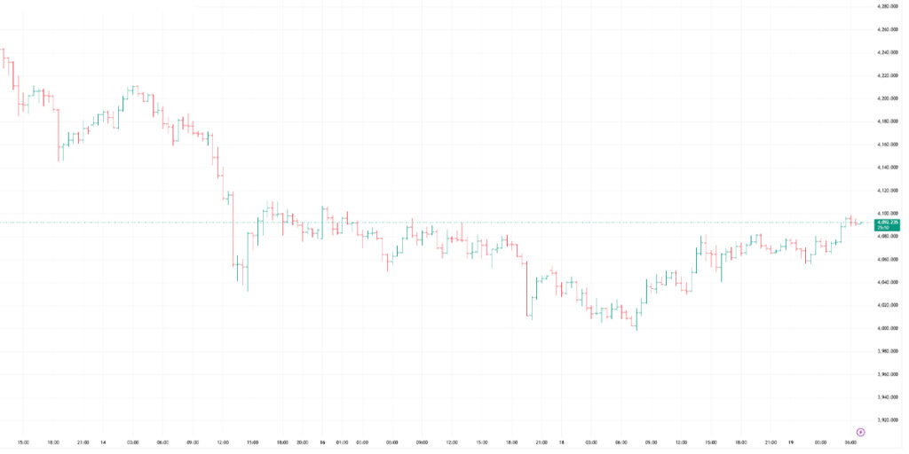
Bar charts use vertical lines with horizontal marks for open, high, low, and close prices. Each bar shows a specific time frame, giving detailed price action without being too complex. At first glance, bar charts may appear dense, but with practice, they reveal a tremendous amount of information.
Candlestick Charts
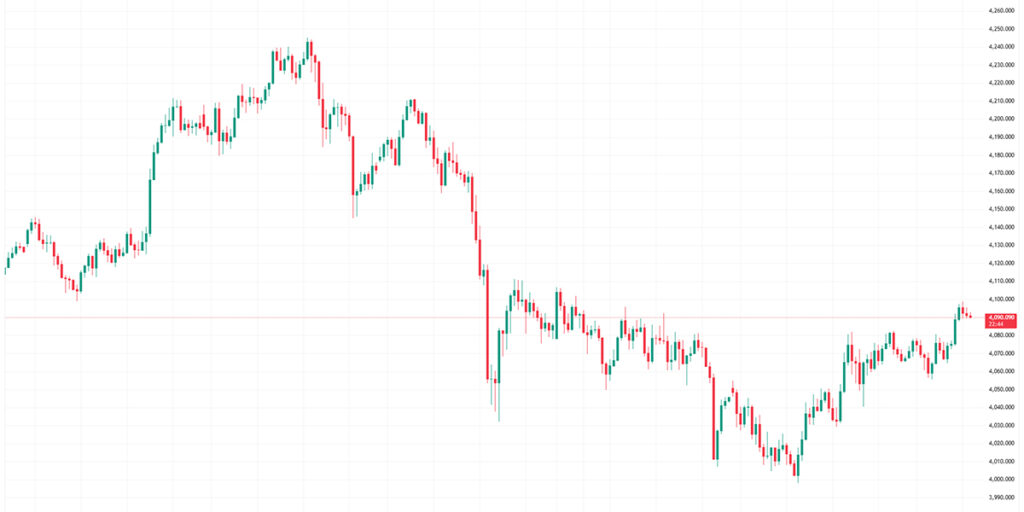
Candlestick charts show price changes with colored bars (candles). The body shows open and close prices, and wicks show daily highs and lows. Red and green colors quickly show if the market is going up or down. Candlestick patterns like hammers, engulfing candles, and dojis further refine a trader’s understanding of potential reversals or trend continuation, making this chart type the most widely used across global markets.
The Role of Volume in Chart Analysis
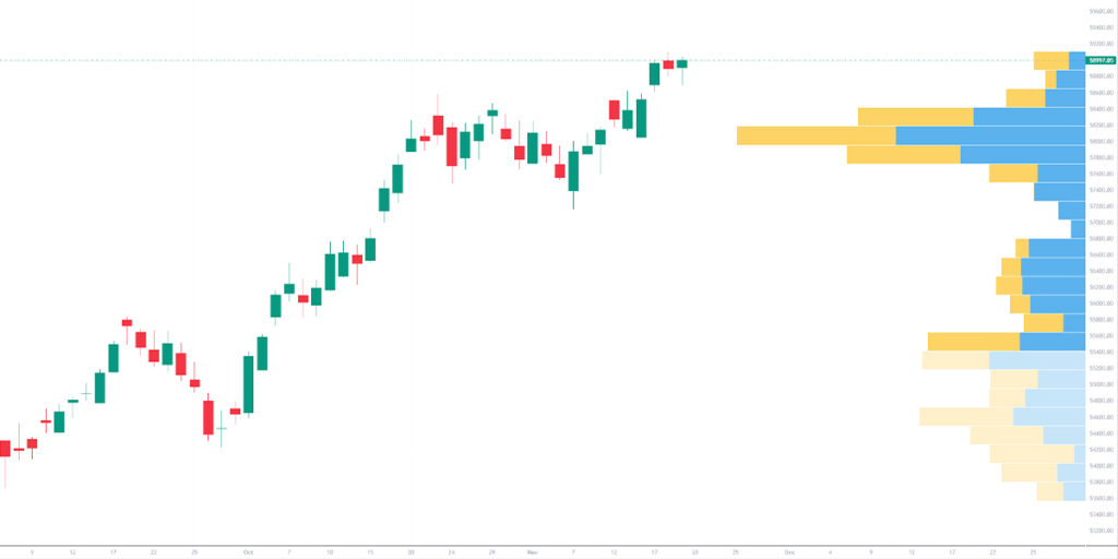
Volume is one of the most significant indicators on a trading chart alongside price action. Volume shows how many trades occurred during a specific period, revealing the level of activity and market participation behind a price move. High volume confirms strong conviction, meaning the price movement is backed by many traders, while low volume often indicates hesitation or consolidation.
When price rises on strong volume, it often signals genuine buying interest and a sustainable uptrend. Conversely, rising prices on declining volume may hint at a weakening trend. Sudden spikes in volume typically occur during news events or economic releases, signalling potential volatility and rapid price swings. Understanding volume helps traders separate meaningful moves from temporary fluctuations.
Recognising Trends in Market Movement
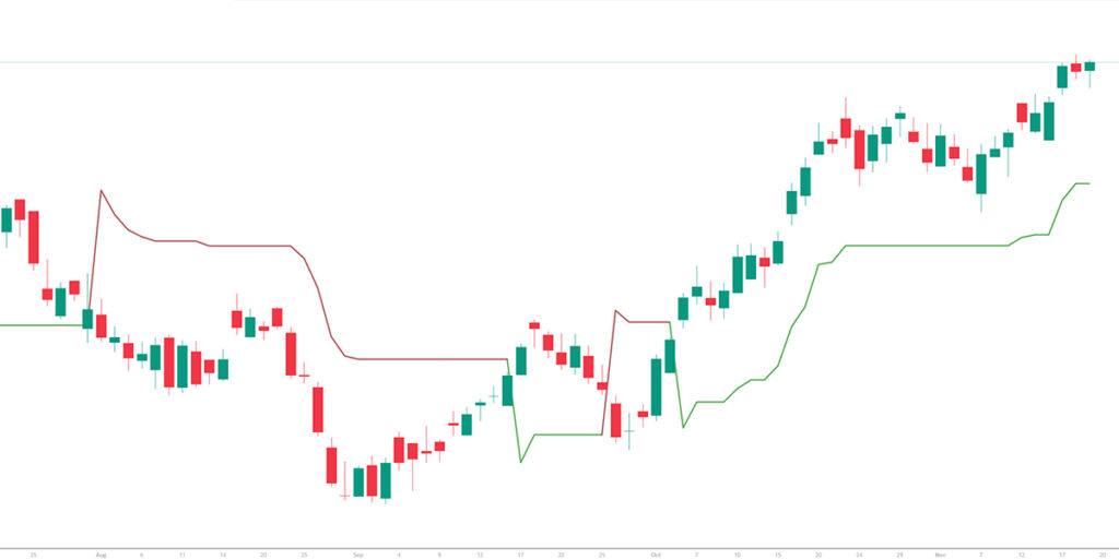
One of the most fundamental skills in chart reading is identifying trends. Markets move in patterns, and recognizing whether a trend is upward, downward, or sideways provides the basis for strategic decision-making.
An uptrend forms when price consistently creates higher highs and higher lows, signalling strong buying pressure and positive sentiment. A downtrend occurs when price consistently forms lower highs and lower lows, indicating increasing selling pressure. Sideways markets develop when the price remains trapped within a range, oscillating between support and resistance while traders wait for a breakout.
Evaluating trends requires observing the slope of price movement, studying recent swing highs and lows, and confirming trend strength through volume. Traders who learn to recognize trends early often position themselves advantageously, especially during major market shifts.
A Practical, Step-by-Step Approach to Reading Trading Charts
Here is a methodical approach to analyzing the charts effectively.
- Start by identifying the type of chart you are viewing, whether line, bar, or candlestick, as this shapes how price is represented.
- Check the timeframe to ensure it aligns with your style of trading. Short timeframes reveal quick fluctuations suited for scalping, while longer ones help identify overall trend structure.
- Observe the general direction of price movement to determine whether the market is trending upward, downward, or consolidating.
- Review volume to see whether the price movements carry strong conviction.
- Identify major support and resistance levels, which often act as turning points in market behavior.
These steps form the foundation of chart analysis and help create disciplined, confident traders.
An Introduction to Technical Analysis
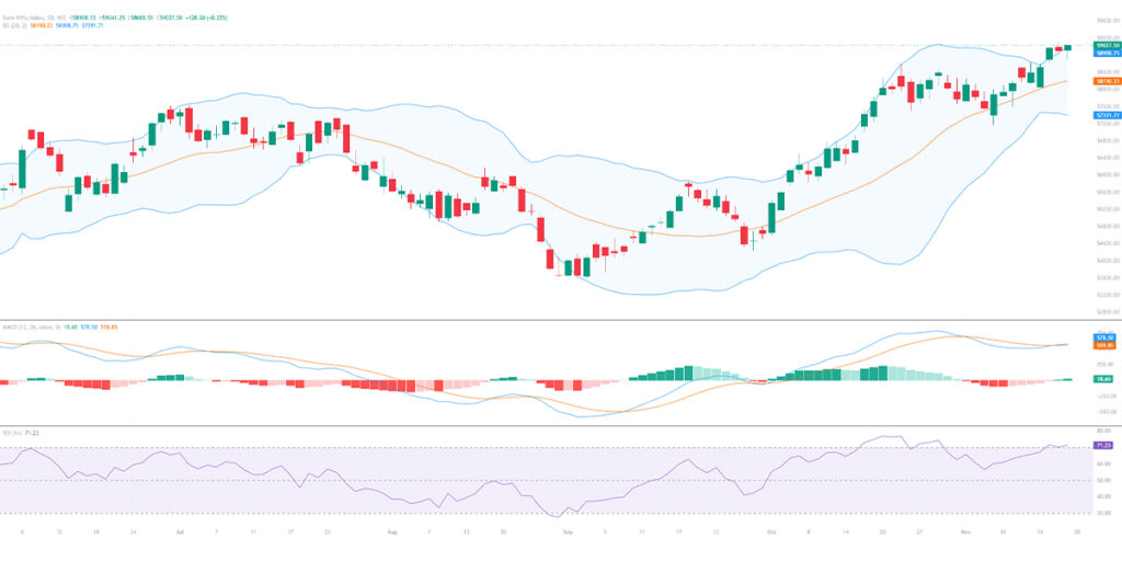
Technical analysis complements chart reading by providing mathematical indicators that reveal additional insights. Moving averages smooth price data to help identify trend direction. The Relative Strength Index (RSI) shows when markets are potentially overbought or oversold, signaling possible reversals. The MACD indicator tracks changes in momentum, helping traders spot shifts in trend strength. Bollinger Bands illustrate volatility and potential mean-reversion zones.
Each indicator offers a different perspective, but none should be used in isolation. The strongest strategies combine price action, volume, trend recognition, and indicator-based confirmation.
Build confidence through charts.
Learning to read chart types and trends helps traders see market movements clearly. This clarity opens up new opportunities. As with any skill, chart reading improves through consistent practice and exposure to real market conditions. VT Markets provides transparent pricing, advanced charting tools, and real-time market insights designed to help traders interpret trends with precision.
The more you engage with charts, the more intuitive your understanding becomes. Over time, patterns emerge more clearly, trends become easier to recognize, and your trading decisions become more structured and objective.


